THE CASE STUDY
Building a destination collection around local pride, camp humor, and the pleasure of an ordinary day at the lake.
-
Place and audience Find the references that carry meaning.
-
Creative territory Local pride, camp humor, and quiet escape.
-
Collection Make the ideas work together as objects.
The creative brief
Develop a destination-merchandise concept collection for longtime Mainers and outdoor visitors who appreciate the character of Chesuncook. The work needed to feel rooted in a particular place and appealing at the small scale of a bumper sticker or die-cut decal.
My role and remit
I researched local references, defined audience and creative territories, developed copy, and directed visual iterations. I organized a 25-concept review collection with rationale and production considerations so the designs could be discussed as a coherent set of choices.
Three complementary directions
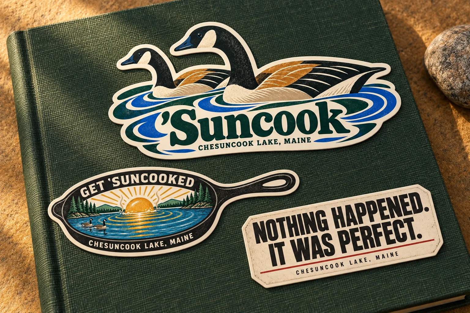
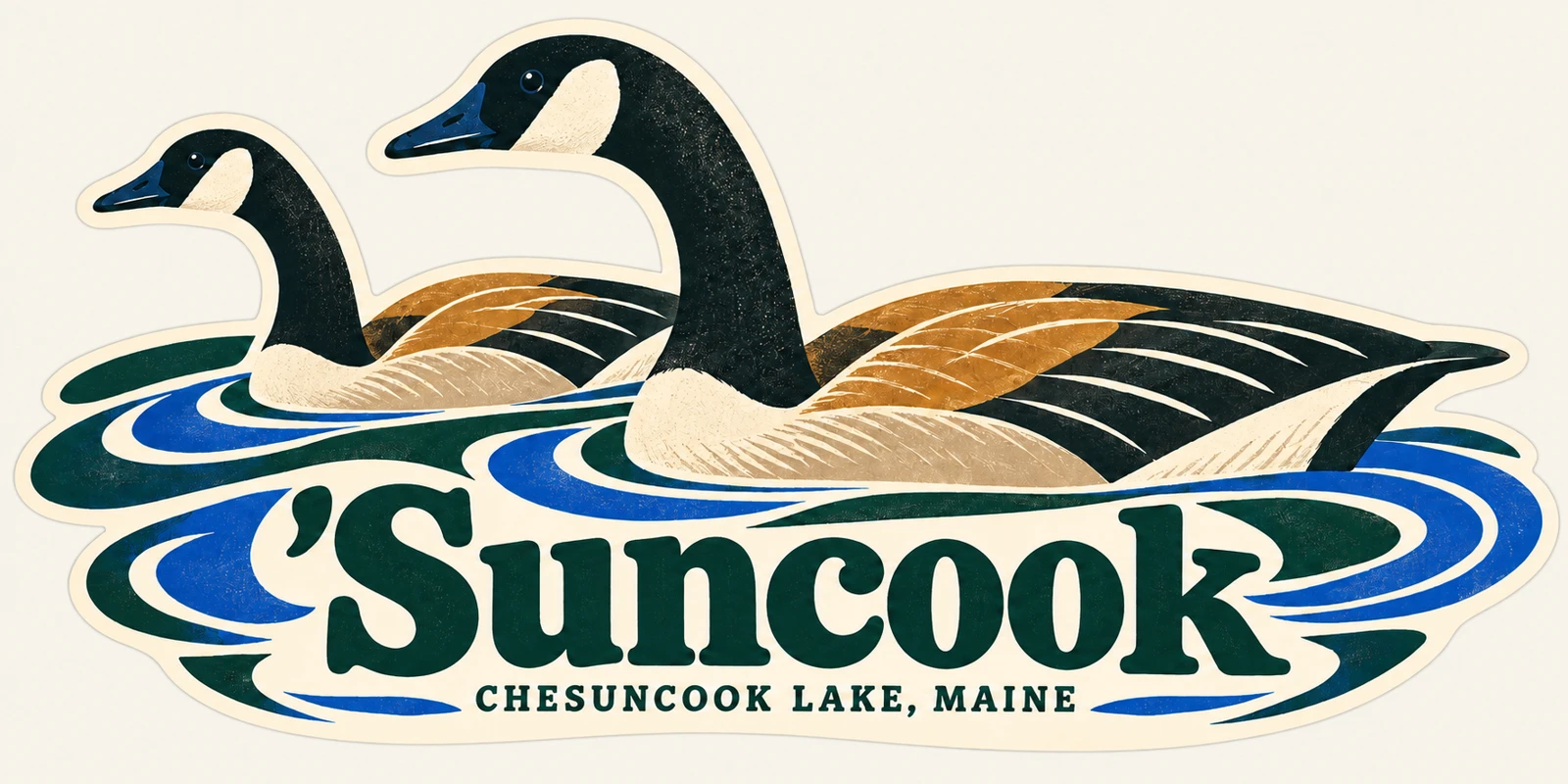
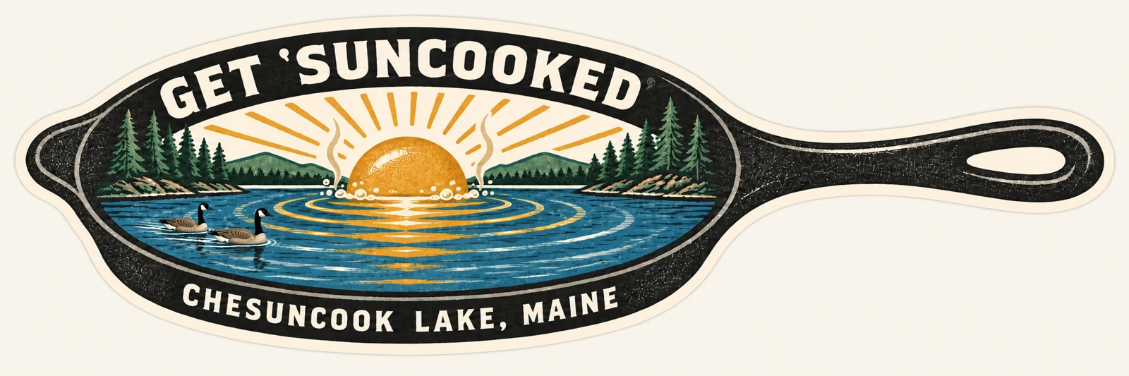
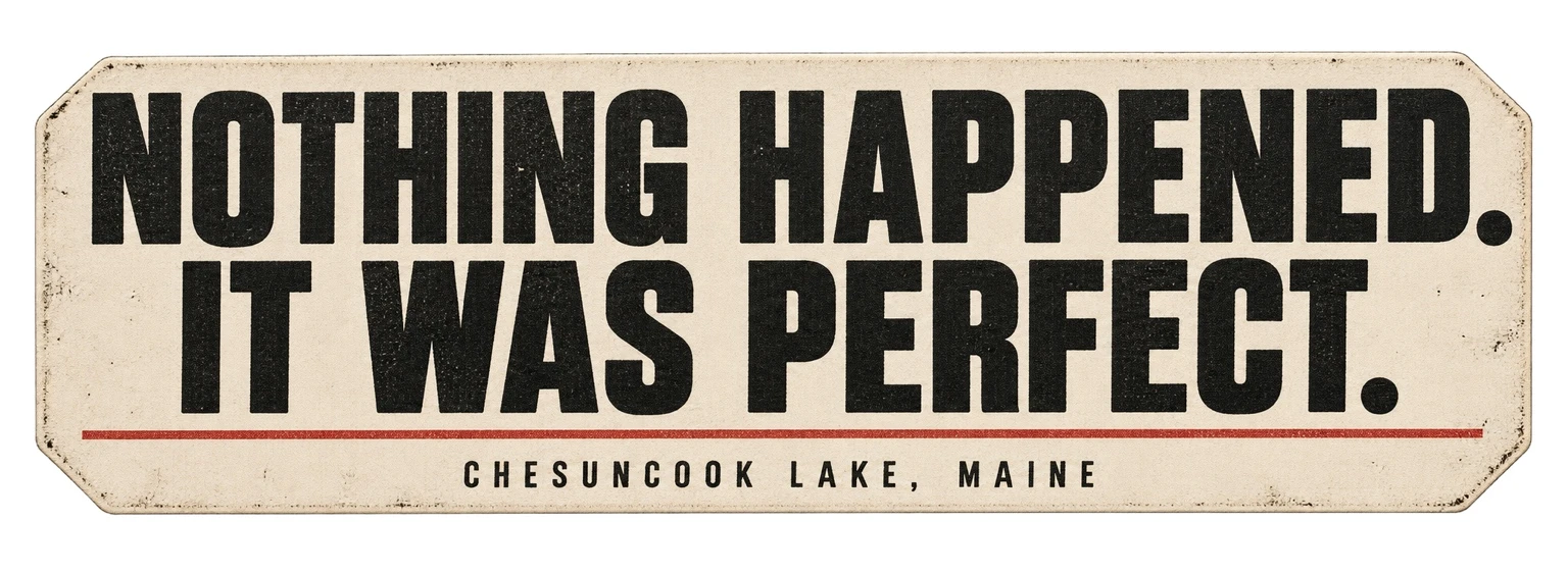
The geese design gives local pride a recognizable wildlife image. The skillet turns “Suncook” into a visual joke through a sun cooking in cast iron. “Nothing happened. It was perfect.” captures the quieter appeal of time at camp. These directions offer different emotional entry points while sharing a connection to outdoor life and place.
Design for the object
The concepts integrate lettering with the illustration so the image and the destination name read as one design. Shape, proportion, contrast, and the relationship between copy and artwork were part of the iteration. The collection explores different visual approaches while keeping the intended decal format in view.
What I delivered
The output is a concept review collection with creative rationale, supporting local context, and production considerations. The portfolio shows selected original artwork and a new collection mockup on a camp journal, making it easier to imagine the designs as a coordinated group of physical objects.
Evidence of value
The case demonstrates research-led creative strategy, distinctive copy, visual direction, and the ability to explain design choices to a client. The new product scene is a portfolio mockup made with AI-assisted imagery. The concepts remain design studies, with final print preparation and real-world retail performance outside the claims made here.
Concept studies, not final print artwork. Illustration development was AI-assisted. No retail-performance claims are made.